Travel Guide

PP Neue Montreal to its fullest.
Montreal
Reworked,
Reintroduced.
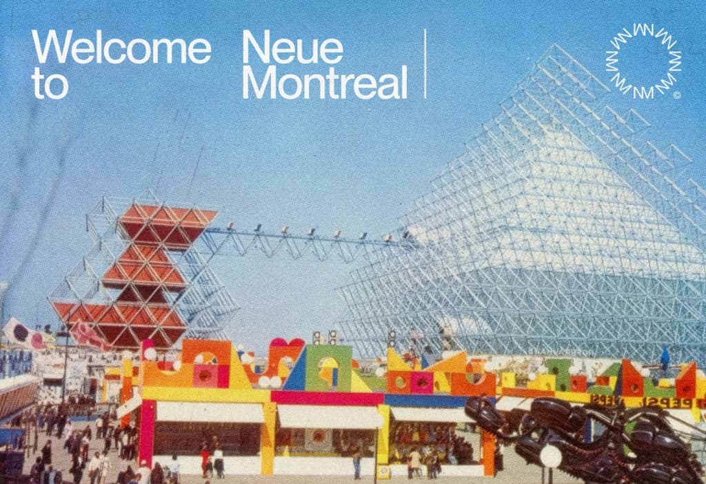
PP Neue Montreal is a neo-grotesk sans-serif typeface that reflects the design sensibilities of Montreal, Canada. Its clean lines and geometric forms are reminiscent of the city's modernist architecture and the International Typographic Style that influenced it.
The font's subtle character and nuanced details evoke the city's history and cultural identity. With its balanced and versatile design, PP Neue Montreal is well-suited for a variety of applications, from digital media to print materials. The typeface's understated elegance and sophistication make it an effective tool for designers seeking to convey a sense of modernity and refinement.
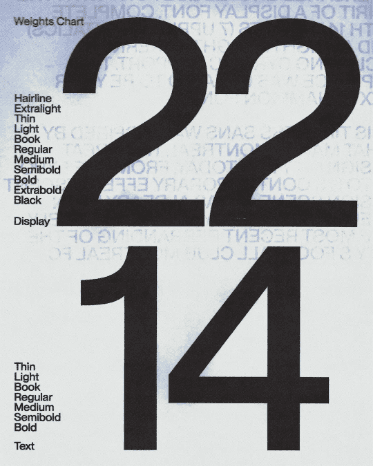
Text
Thin
Light
Book
Regular
Medium
Semibold
Bold
+Italics
Display
Hairline
Extralight
Thin
Light
Book
Regular
Medium
Semibold
Bold
Extrabold
Black
+Italics
2018
2019
2020
2021
2022
2023
2024
2025
2026
First Release
Minor Updates
Minor Updates
Square Punctuations
V02 Release
Mono Version
Squeezed Collection (Off-Type)
Minor Updates
V03 Release
The
Universal
Font


Hairline
From Vieux-Montreal
to Neue-Montreal
Montreal is a vibrant city where North American energy meets European charm. Located on an island in the Saint Lawrence River, it is known for its rich history, diverse culture, and creative spirit. The city blends old and new effortlessly, from the cobblestone streets of Old Montreal to the modern skyline of downtown. French is the main language, but English and many other languages can be heard throughout its neighborhoods, giving the city an international feel.
Text Black
Must-See Attractions
Montréal is a city of contrasts, where centuries-old cobblestone meets bold brutalist architecture, and every neighbourhood tells a different story.
Must-See Attractions
Montréal is a city of contrasts, where centuries-old cobblestone meets bold brutalist architecture, and every neighbourhood tells a different story.
display and text
Text
Display
Display
Extrabold
Text
Medium
The Art of Letters
Coming Together
Where two letters become one. PP Neue Montréal's ligatures are quietly refined designed to let text flow without interruption, preserving the rhythm of a word while adding a layer of craft most readers will feel before they ever notice.
Weights
Chart
Jovial Québec fans mix waltz, bringing Expo 67 charm to Montréal.
Accents & Diacritics
Every mark,
perfectly placed
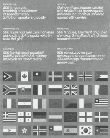
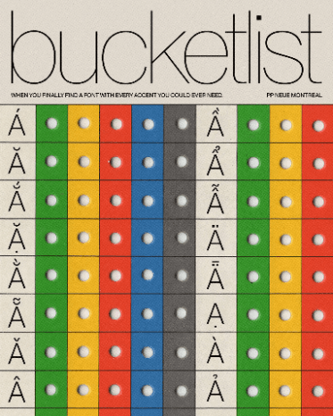
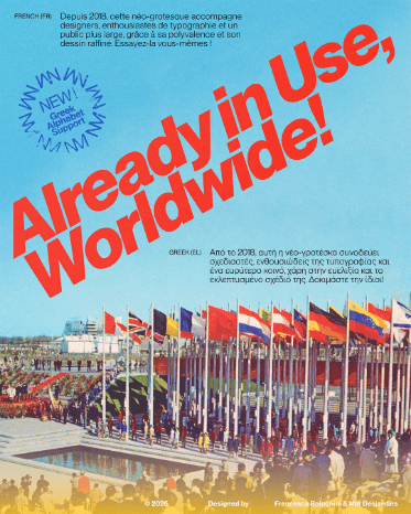
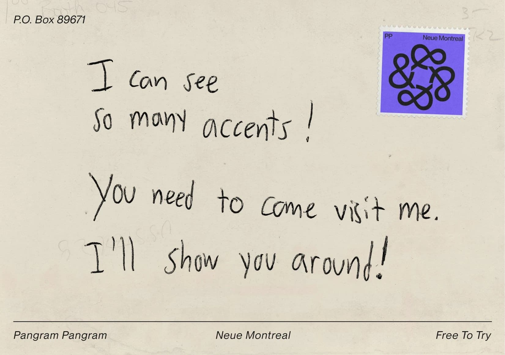
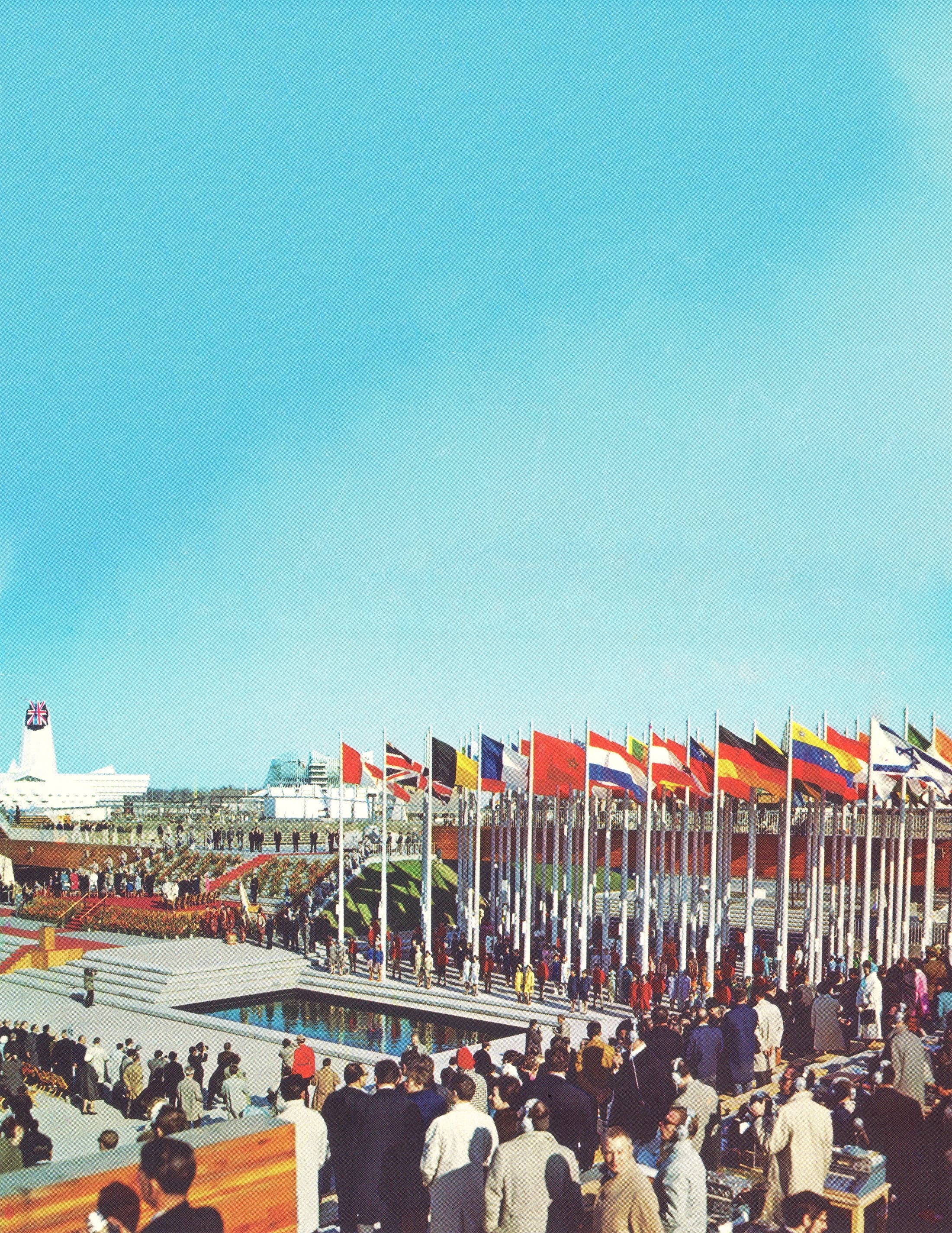
Inspired by the multicultural energy of Expo 67, where 62 nations converged on Montreal, Neue Montreal was built to speak every language fluently. Its extensive range of accents and diacritical marks ensures that no character loses its form or rhythm, no matter the tongue. Each accent is drawn with the same precision as the base letterform: nothing feels added, everything belongs.
Built for the city,
read on the move
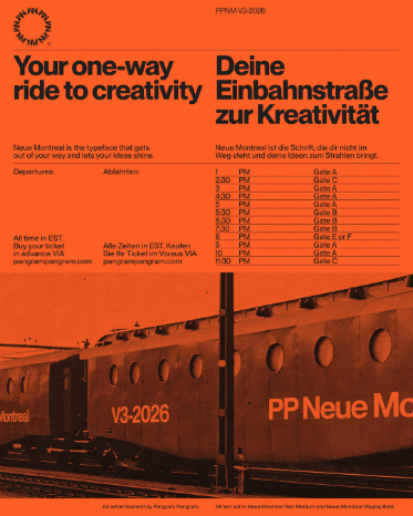
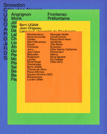
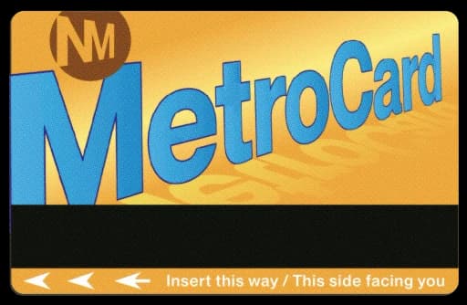
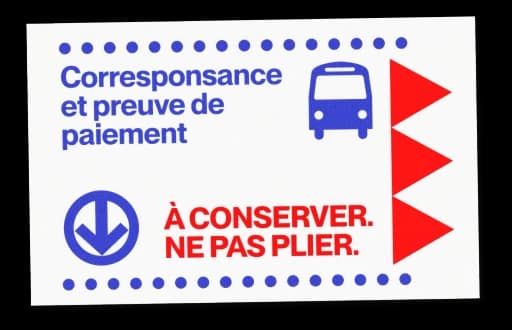
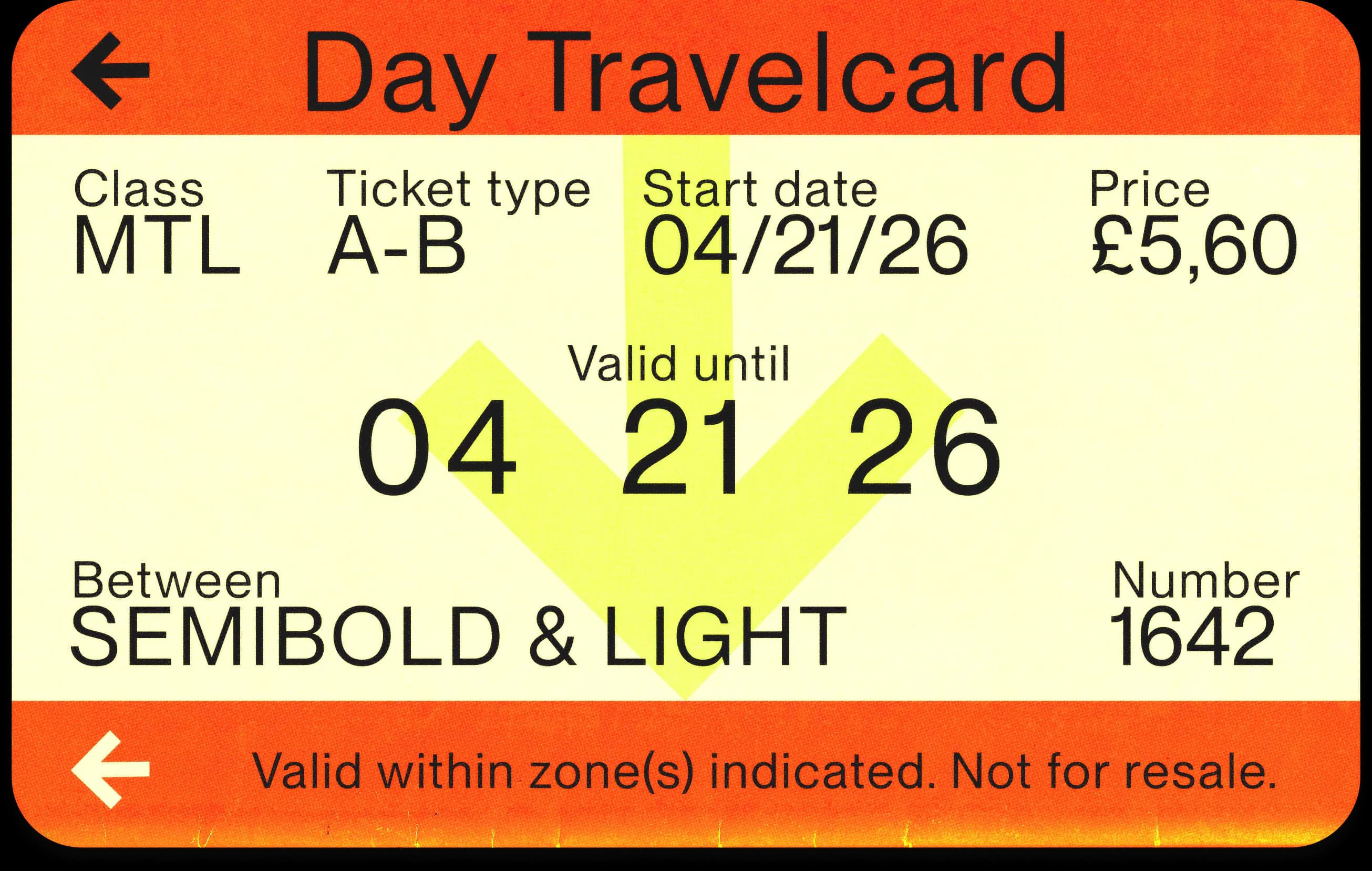
From platform signage to pocket-sized tickets, Neue Montreal was made for urban life. Its legibility holds at every scale whether printed on a transit pass or displayed on a departure board. A typeface that moves as fast as the city it was named after.
Get from
one point,
to another!
(Square to round dots)
language of Expo 67A typeface shaped by
the streets and soul
of Montreal
Montreal
Display
Neue
Montreal
was
Montreal
Montreal
Text
A grotesque rooted in the typographic language of 1960s modernism, shaped by the visual ambition of Expo 67. Neue Montreal is its contemporary reimagining: refined, expanded, and built for today's screens and streets. Same city.
One font fits all.
There are also alternative versions: Squeezed tightens the letterforms, while Mono uses fixed-width spacing for a more rigid feel.